Tips & Tricks on your Tri-fold

- Don't wait until the last minute. A great board takes time to put together, and students can work on sections of the board even before the project is complete.
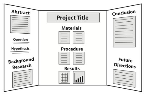 Storyboard the display board. On a blank sheet of paper, block out the sections you will include and where they will go. This will help you determine how best to fill the space, help you decide what to include, and serves as a blueprint for assembling the board sections.
- Use the steps of the scientific method or engineering design process as a guide. The stages of a student's project can be used to help prepare and organize the sections of the display board.
- Make use of headers. The title, headers, and even subheads help a user make sense of the material on the board at a glance.
- Pay attention to the assignment. Teachers may request certain project components be included on the board, so be sure and check any rubric or assignment sheet provided.
- Be careful to ensure the elements on the board are readable. Headlines and titles should be readable at a distance. There is plenty of space, so larger fonts work well.
- Use visual elements to grab attention. Headlines, photos, charts and diagrams, borders, trims, and even background design elements related to the project can help draw attention to your board.
- Be neat. A well-executed display board is neatly done, contains printed sections (not handwritten), and shows care and organization.
- Show off your exciting project!
Science Fair Project Display Board Checklist
| What Makes for a Good Science Fair Project Display Board? | For a Good Science Fair Project Display Board, You Should Answer "Yes" to Every Question |
|---|---|
Does your display board include:
| Yes / No |
| Are the sections on your display board organized like a newspaper so that they are easy to follow? | Yes / No |
| Is the text font large enough to be read easily (at least 16 points)? | Yes / No |
| Does the title catch people's attention, and is the title font large enough to be read from across the room? | Yes / No |
| Did you use pictures and diagrams to effectively convey information about your science fair project? | Yes / No |
| Have you constructed your display board as neatly as possible? | Yes / No |
| Did you proofread your display board? | Yes / No |
FONT SIZE  | Yes / No |
- Use a font size of at least 16 points for your main body text. Anything smaller is too hard to read. (See the following tables for more information on text size.)
- Stick with traditional fonts like Arial, Times New Roman, or similar typefaces.
- Use italics or bold for emphasis, not for all your text.
- Don't place your text on top of a picture; that makes it difficult to read.
- Don't use ALL CAPS; THEY ARE MUCH HARDER TO READ.
- Don't use reverse type (white text on a dark background).
It is hard to read. Use black characters on a white (or pastel) background. 
They are much harder to read.- Don't use more than two or three different fonts on your board. Times New Roman for body copy and Arial for headings makes for a nice combination.


No comments:
Post a Comment